Austin paint color guide
How to Choose Paint Colors for Your Home in Austin
To choose paint colors for your Austin home, start with the fixed finishes, study how the color behaves in real light, then test large samples before you commit. The right color should work with your floors, stone, roof, cabinets, furniture, and Texas sun. Tiny chips and wishful thinking are not a color strategy.
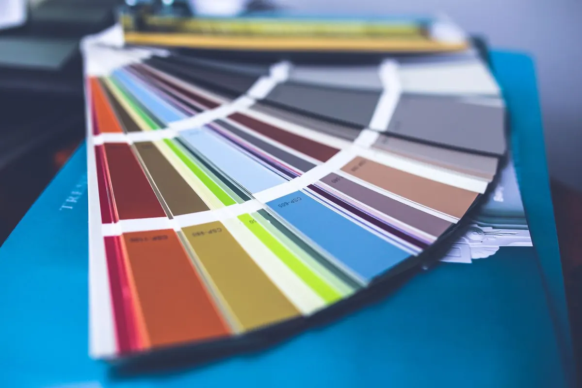
The short version
Good paint colors are chosen in context, not in isolation.
The fastest way to pick better paint colors is to stop asking, "What color do I like?" and start asking, "What color works with this house?" Austin homes often have warm stone, beige tile, black fixtures, oak floors, white cabinets, shaded porches, blazing west-facing walls, and open layouts all trying to vote at once.
A color that ignores those details can look wrong even if the chip was beautiful. A color that respects them looks custom, calm, and expensive without trying too hard.
Start with what is staying
Floors, stone, brick, counters, cabinets, tile, roof color, and window frames should guide the palette before you look at trendy colors.
Study the light
Austin sun can make colors look brighter and warmer outside, while north-facing rooms can make grays and blues feel cooler indoors.
Choose a main neutral
Most homes need one dependable base color that connects the larger spaces. Accent colors should support it, not fight it.
Sample at real scale
Paint large samples, view them at different times of day, and compare them beside the actual trim, floors, stone, and furniture.
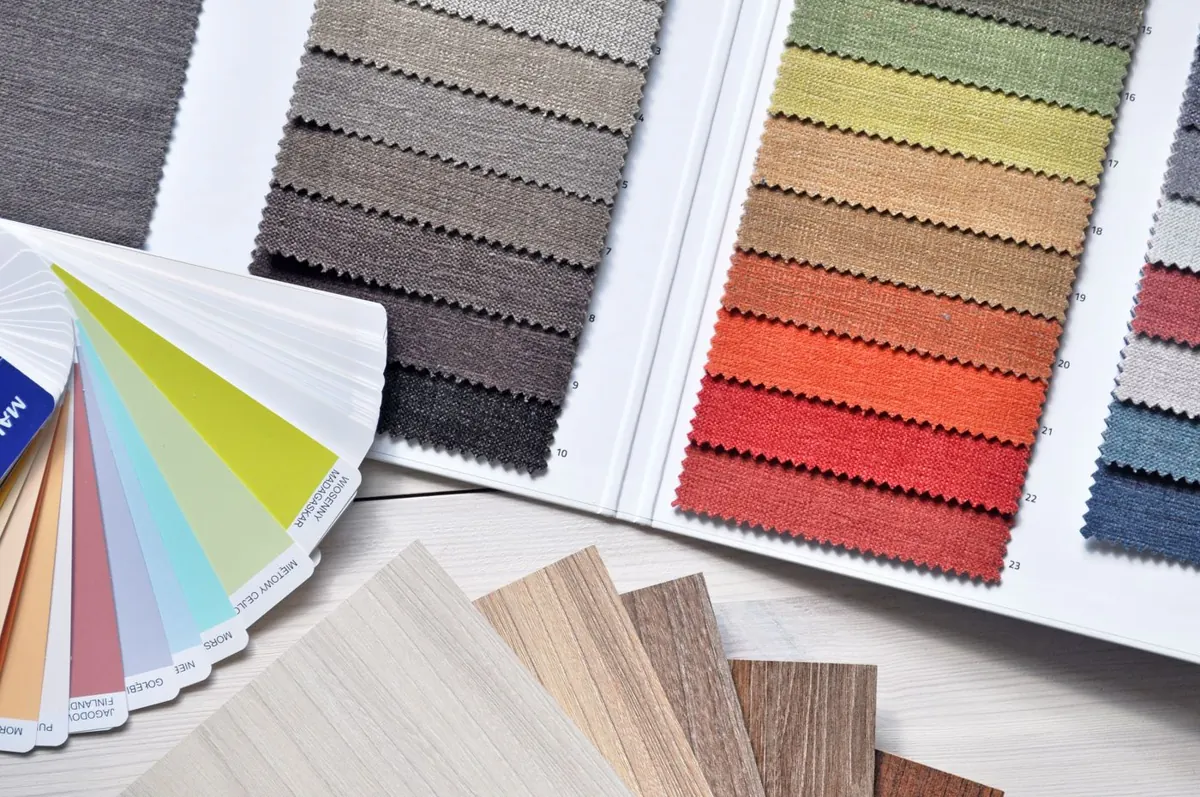
Austin light
Texas light can make a safe color act dramatic.
Austin light is strong. South- and west-facing exteriors can make colors look lighter, brighter, and more saturated. Indoors, a room with big afternoon windows can turn a quiet neutral warmer than expected.
North-facing rooms usually feel cooler, which can pull blue, green, or purple undertones out of grays and whites. East-facing rooms glow in the morning and calm down later. West-facing rooms can look great at breakfast and suddenly feel peachy by dinner. Paint has a schedule.
That is why large samples matter. Test your finalists on different walls and check them in morning light, afternoon light, evening light, and under your actual bulbs.
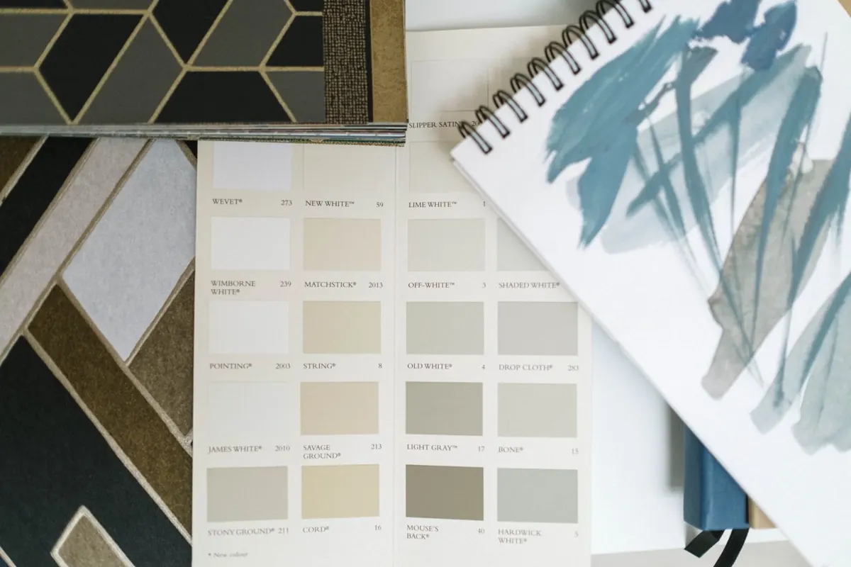
Start with what stays
Floors, stone, brick, cabinets, and roofs should lead the palette.
Fixed finishes are the boss. If your home has cream limestone, warm tile, red brick, gray plank flooring, black windows, or stained wood, the paint color needs to cooperate with those surfaces.
This is where many color mistakes happen. A cool white beside warm limestone can make the stone look yellow. A trendy gray beside beige tile can turn purple. A bold exterior body color can fight the roof. The wall color is only one player on the field.
Pull undertones from the materials that are not changing. If the stone has cream and taupe notes, start there. If the floor is warm oak, avoid colors that make it look orange. If the roof is brown, do not pretend it is black.
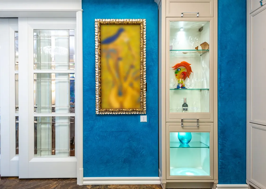
Interior color direction
Interior colors should support the way the room is used.
Bedrooms can be softer. Offices can handle more focus and depth. Kitchens need to play nicely with cabinets, counters, backsplash, and lighting. Living rooms usually need the most flexibility because they connect to everything else.
Warm whites
Great for bright living areas, hallways, kitchens, and homes with cream stone, warm tile, or natural wood.
Soft greige
Useful when you want warmth without yellow. Works well in open plans when floors and counters are mixed.
Muted sage
A calm choice for offices, bedrooms, cabinets, and rooms with plants, wood, black fixtures, or brass details.
Dusty blue
Good for bedrooms, baths, and select living spaces when the undertone is grayed down enough for Texas light.
Clay or terracotta
Best as an accent, dining-room color, powder-room moment, or front-door direction rather than an every-room color.
Charcoal accents
Strong for doors, built-ins, fireplaces, and office walls when the room has enough light and contrast.
If you are planning more than one room, our interior painting service can help you think through color flow, sheen, repairs, and room-by-room scheduling.
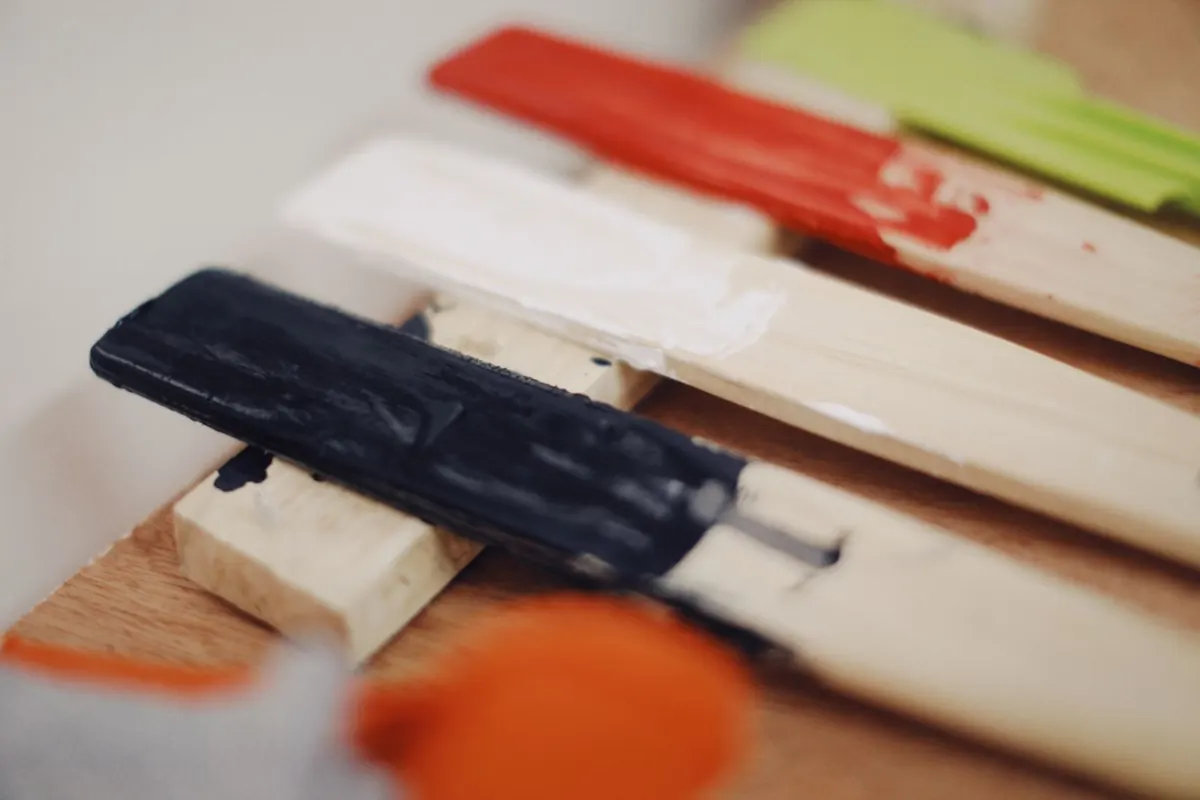
Exterior color direction
Exterior colors need to survive sun, scale, and the neighborhood.
Exterior colors look different because they are bigger, brighter, and viewed from farther away. A color that looks deep on a chip can look gentle across a whole elevation. A color that looks lively indoors can look loud outside by noon.
In Central Texas, warm whites, stone-inspired taupes, muted greens, dusty blue-grays, soft black trim, bronze accents, and restrained door colors often feel more timeless than high-saturation choices.
Planning an exterior repaint? Read our guide to the best exterior paint for Texas heat and our exterior painting service page.
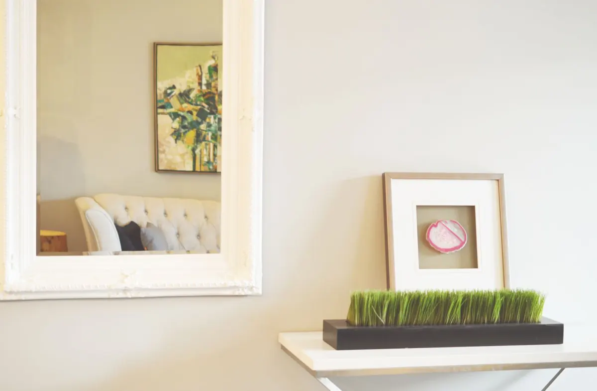
Open floor plans
Connected spaces need color flow, not copy-and-paste beige.
Many Austin homes have an entry, living room, dining area, and kitchen sharing long sightlines. One main neutral can create calm continuity, but every connected room does not have to be identical.
Use related undertones and clear stopping points. A warm white main area can connect to a muted sage office, a clay powder room, and a deeper charcoal built-in if the palette repeats warmth and contrast in a controlled way.
Trim color is the thread that ties it together. Doors, casing, baseboards, and ceilings can keep the home feeling cohesive while wall colors shift from room to room.
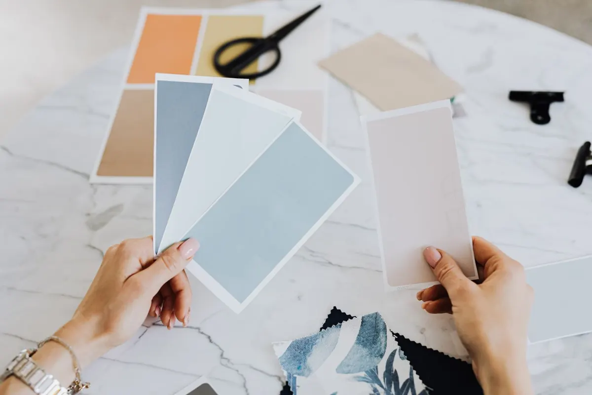
Sample before you commit
Use big samples and check them like you mean it.
- 1Pick two or three finalists instead of ten almost-identical maybes.
- 2Paint large sample boards or big wall sections with two coats.
- 3Move interior samples to different walls and check them throughout the day.
- 4View exterior samples beside roof, stone, brick, windows, and trim.
- 5Check the color under your actual nighttime lighting.
- 6Choose sheen after color, because sheen changes how light reflects.
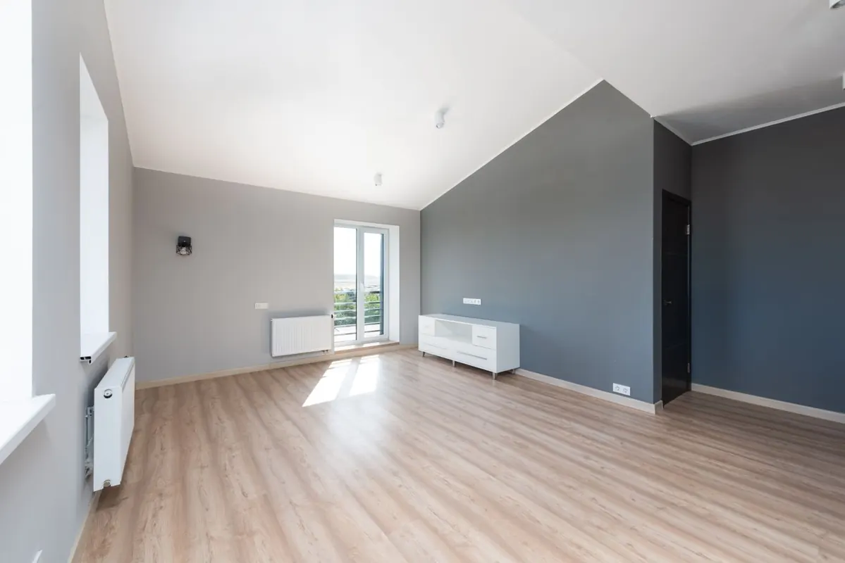
Common mistakes
Paint color mistakes are usually avoidable.
Choosing from a tiny chip
A two-inch swatch cannot show how a color behaves across a whole wall. Large samples reveal undertones, brightness, and weird surprises before they become expensive.
Ignoring fixed finishes
A beautiful wall color can look wrong beside the wrong flooring, stone, roof, or countertop. The color is not alone in the room.
Going too gray
Cool grays can feel flat or blue in some Austin homes, especially beside warm tile, limestone, or wood. Balanced warm neutrals often age better.
Forgetting sheen
Sheen changes how color reflects light. Satin, eggshell, matte, and semi-gloss can make the same color feel noticeably different.
For more manufacturer color inspiration, browse official Sherwin-Williams color collections and Benjamin Moore paint colors. Use them for direction, then test in your actual Austin home.
Free Austin estimate
Want help choosing colors that actually work in your home?
Tell us about your rooms, exterior, lighting, and timeline. We will help you think through prep, sheen, color flow, and the next steps before paint goes on the wall.
FAQ
Paint color questions Austin homeowners ask.
How do I choose paint colors for my home in Austin?
Start with your fixed finishes, study the natural light, choose a main neutral, then test large samples in the actual room or exterior area. Austin sun, limestone, warm tile, roof color, and open floor plans all affect how paint reads.
What paint colors work best in Austin homes?
Warm whites, soft greiges, muted sages, dusty blues, limestone-inspired taupes, clay accents, and restrained charcoal details usually work well. The best color depends on the home's light, architecture, flooring, stone, and personal style.
Why does my paint sample look different at home?
Paint changes with light, surrounding colors, sheen, and the size of the painted area. A color that looks calm in a store can look brighter, cooler, warmer, or more saturated inside your Austin home.
Should interior paint colors match throughout the whole house?
Not always. Open areas should feel connected, but bedrooms, offices, powder rooms, and built-ins can use related accent colors. The key is repeating undertones and choosing logical stopping points.
How many paint colors should I test?
Two or three serious finalists are usually enough. Testing too many colors at once creates decision fatigue, while testing none is how people end up repainting a wall they just paid for.
Can New Life Painting help with paint color decisions?
Yes. During an estimate, we can talk through lighting, finish choices, surface condition, trim color, and the overall project plan so the color decision fits the home and the scope.
Related guides and services